Even though there's still snow EVERYWHERE, stores refuse
to care and are stocked with loads of pastels.
I probably have something of every colour in my
wardrobe but pastel tones, by far, are the most infrequently found. I find pastels difficult to wear and
difficult to style. They often look too
old, too young, too frumpy, too saccharine and sometimes just too uncool. Pastels in spring are ubiquitous, and I've
been experimenting with my most feared colour group lately. I present to you, dear reader, my findings/ramblings,
grouped by colour, in something I call 'The Vitamin J Guide to Pastels'.
OVERALL
TIPS
Balance in all things
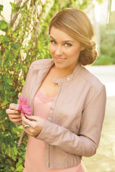
from LC Lauren Conrad for Kohl's 2011 collection
Pastels
have a tendency to get too cute too fast.
Since the colour reads feminine and/or juvenile, make sure to balance
this out by not wearing too much pastel in one outfit and to wear sleeker and
edgier shapes. Minimize ruffles, bows, flowers and other feminine details. Pair with leather, denim and other more rugged and masculine-type materials. Try simple shapes like basic collared shirts, skinny jeans and pencil skirts with few details.
Tone it down
from RW&Co Spring/Summer 2014 collection
The
easiest pastels to wear are desaturated ones.
For example, instead of baby blue, try one that reads more as ice blue
or blue-grey. Desaturated pinks and
browns can often read as neutrals and are easier to style. You can also go the complete opposite way and choose more saturated and brighter tones, which I find are also easier to wear. There's less risk of washing yourself out and brighter colours generally look less juvenile.
Cross those seasonal barriers
from Le Chateau Spring/Summer 2014 collection
Pastels
epitomize spring, so it can be hard to wear these colours in other
seasons. An easy way to do it is to pair
with black. This automatically gives off
a sense of more grounded, serious femininity and is a favourite combination of
mine for job interviews. Pairing with any darker colour will do the trick-- brown, navy and burgundy are great colours to try.
SELECT COLOURS
MINT
Mint
has been everywhere recently! Its
definitely a great choice as its on-trend and often does not read as a true
pastel. You can wear a lot of mint without it getting overpowering, so feel
free to experiment with dresses, skirts, pant, etc. However, I recall mint first being exciting
about three years ago, so I feel its on a downwards trajectory as a trend. My advice is to pick up a few things if you
like the colour, but don't go overboard as I don't think it'll be super hot in
the coming seasons.
Easy
pairings: black, grey, white, bronze, gold
BLUSH
Blush
is a great, easy pastel to wear as it can be treated as a neutral and never
really goes out of style. Be careful of
how different shades work with your skin colour-- some can make you look washed
out.
Easy
pairings: black, grey, brown, cobalt, navy, magenta, gold, bronze, silver
LILAC
I
haven't seen too much lilac in-stores, but I have a feeling that in upcoming
seasons, it will be like mint was last year.
With lilac, definitely stick to less frilly and feminine items;
menswear-inspired pieces like collared shirts and blazers would look
great. You can also try a more
desaturated colour with grey
undertones for an easier to style piece.
Easy
pairings: grey, beige, camel, cobalt, navy
ICE
BLUE
Like
lilac, I feel like ice blue will be a bigger colour given some time. Blue reads more masculine, so this is the one
colour you can go with more feminine details without it being
overpowering. Chambray's also a great
choice that is technically light blue, but reads more rugged than pastel.
Baby blue personally terrifies me as I grew up in the 90's. I would avoid baby blue (and baby pink)
as it currently reads dated and instead go for something either more or less saturated.
Easy
pairings: charcoal, navy, white
GREY
Not
technically a pastel, but I included it as it’s a great colour to incorporate
along with pastels for spring. It’s a
good neutral that’s less heavy than black but is more graphic than brown
shades, and thus plays well into the graphic, black and white look that’s
currently trending for this spring. Grey
looks great with texture, so try it in velvet or silk.
THE REST
Yellow and spring green aren't quite as hot this season. I feel that except for the coral that usually pops up around this time, cooler tones predominate. White isn't a pastel, but is always, always in for spring and summer and works with most pastels very well.
The great thing about pastels is that you can find one that will work for you. What's your favourite pastel tone for Spring/Summer 2014?